As you probably know, the amount of people shopping online using their mobile phones and tablets are increasing in a very fast rate. And to survive the competition you probably know that you need to create a responsive mobile friendly online store. Mobile Friendly eCommerce Website
The question here is how to do it like a pro? Watch out, answers are coming in your way in the next infographic.

-
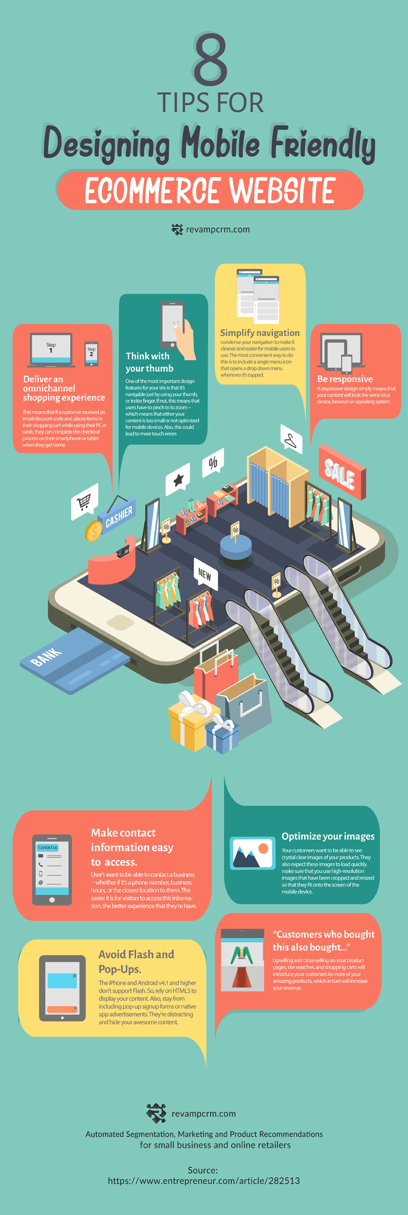
Be responsive
A responsive design simply means that your content will look the same on a device, browser or operating system.
-
Deliver an omnichannel shopping experience
This means that if a customer received an email discount code and place items in their shopping cart while using their PC at work, they can complete the checkout process on their smartphone or tablet when they get home.
-
Think with your thumb
One of the most important design features for your site is that it’s navigable just by using your thumb, or index finger. If not, this means that users have to pinch to to zoom — which means that either your content is too small or not optimized for mobile devices. Also, this could lead to more touch errors. Mobile Friendly eCommerce Website
-
Simplify navigation
condense your navigation to make it cleaner and easier for mobile users to use. The most convenient way to do this is to include a single menu icon that opens a drop down menu whenever it’s tapped.
-
“Customers who bought this also bought…”
Upselling and cross-selling on your product pages, site searches, and shopping carts will introduce your customers to more of your amazing products, which in turn will increase your revenue.
-
Optimize your images
Your customers want to be able to see crystal clear images of your products. They also expect these images to load quickly. make sure that you use high-resolution images that have been cropped and resized so that they fit onto the screen of the mobile device.
-
Avoid Flash and Pop-Ups
The iPhone and Android v4.1 and higher don’t support Flash. So, rely on HTML5 to display your content. Also, stay from including pop-up signup forms or native app advertisements. They’re distracting and hide your awesome content.
8. Make contact information easy to access
User’s want to be able to contact a business — whether if it’s a phone number, business hours, or the closest location to them. The easier it is for visitors to access this information, the better experience that they have.
Source: Entrepreneur.com
https://www.entrepreneur.com/article/282513
Related Post : https://blog.revampcrm.com/6-easy-ways-to-create-effective-ecommerce-newsletters/


